Chart of the day: Annus horribilis for the markets
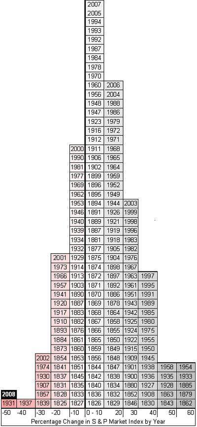
Knowing my love of charts and graphs, several readers have sent me the chart below, which shows just how dismally U.S. stock markets have performed this year. The chart, which comes from econo-whiz and must-read blogger Greg Mankiw, shows the percentage change in the S&P Index for the last 160 or so years.
As you see, in most years the index moves a little bit up or, somewhat less often, a little bit down. But take a look at the wings. Five times since 1825 index has soared more than 60 percent.
But in only two years during the last century-and-a-half has the index dropped by 50 percent or more. One was in the Depression year of 1931. The other was this year.
Unfortunately, I see a lot of ‘200X’s under the zero line, and in almost every bar below.
2000 -10% pile
2001 -20%
2002 -30%
and 2008 -50%
And none in the >30% stacks
UGH
P.S. That is a great chart.
Sic semper economic morons.
The world is getting what it deserves for allowing slavery to re-emerge. What’s average worker pay if competing against slaves? What’s the COMPETITIVE worker pay if competing against slaves? What consumer impact do slaves have globally? Do slaves buy a lot of crap? NO.
Rich people become wealthy because they sell a lot of *stuff* to as many consumers as possible. By constantly undercutting majority consumer buying power, wealthy elites eat into their own profit margins on account of using slaves.
This, of course, is apart from the fact that I can practically feel my Baptist Civil War ancestors rolling in their graves and ready to spring out and strangle those that would allow slavery to once again flourish in the world. If only the dead could march upon the tyrannical…