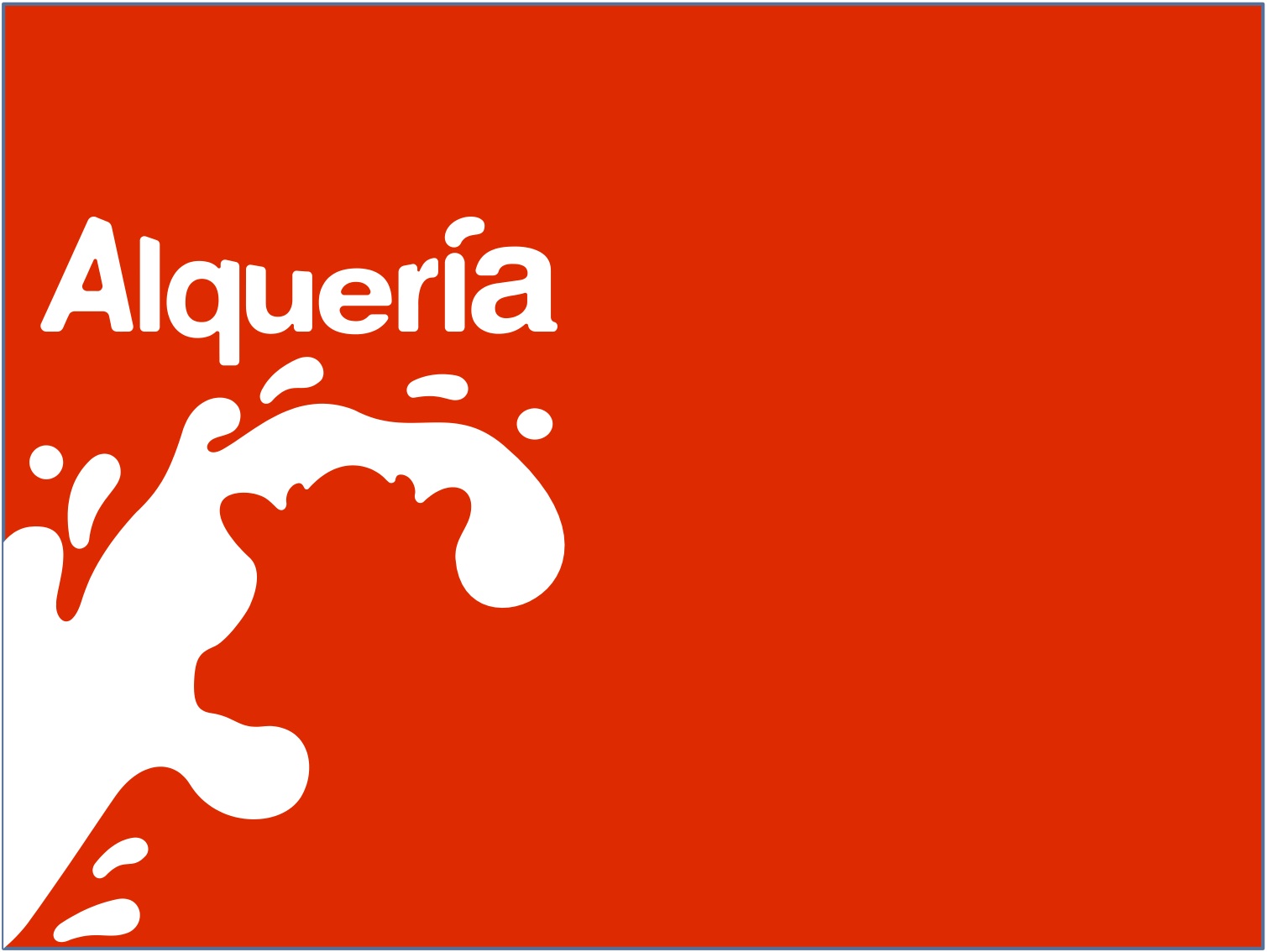
Logo con leche
On a visit to Bogota last week, I saw all kinds of cool things — including some negative space. From Alqueria, a Colombian dairy company run by the innovative Carlos Enrique Cavalier, comes this logo, which simultaneously depicts Alqueria’s main product and the source of that product.
Love it! Simple, elegant, beautiful…
A 21st century version of Charles G. Shaw’s 1947 children’s masterpiece, It Looked Like Spilt Milk!
ha! took me a second- like the hidden “arrow” inside the fedex logo. Brilliant!!
I loved it even before I saw the “source.” Terrific.
very cool
gets the message across without all that design fluff.
Hope you enjoyed your time in Bogota. Our company is split between there and New York City and we’ve built a business thanks to the talented creatives who call Bogota home. Let us know if you’re planning to visit again and we’ll show you some Colombian hospitality!
I own a graphic design company called Rambert Graphic Development and I us red in my own branding. I love the color red because it catches your attention and this logo does that.
La combinación de 2 formas o dibujos, en uno sólo, ingenioso.