In 1966, Robert Indiana gave the world a four-letter sculpture that soon became iconic.
Today, on Design Observer, I saw a piece that pays homage to Indiana. (“Homage to Indiana” is totally a title for a mediocre independent film — Ed.) Like many works that have parodied Indiana’s work, this four-letter sculpture bears a superficial resemblance to its predecessor but creates a distinctly different effect.
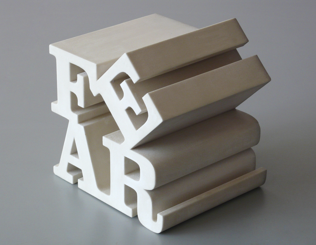
Is this one a new icon for a new time? Or a just another sign of momentary cultural jitters? Or is it something else altogether?
We’re either in love or fear, which one is it going to be?
With regard to FEAR, Roosevelt had it right all along — and not just as it applied/ applies to our economy. And Pixie has it right, too — we get to choose. Fear doesn’t actually exist, unless we let it in. 80% of what we’re afraid of/ worried about never actually happens, at least not in the way we envision it (according to somebody…). So, we could choose to spend our energy on something else. Imagine that. Fear is a vision. We could choose different visions.
What a cool little site 🙂
So first off – it’s totally something else, an icon for the times and a momentary cultural jitter. Which means only that its good Art and everyone can see it a little differently.
Next – when I first saw it I thought the “E” is crooked, then thought “why do that?” and then thought maybe to spell the word “FAR”
Then I read the comments, caught the part from Hope’s comment about the postage stamp, which made the title of the post make sense and made me realize that the only way I knew the “LOVE” sculpture was from a postage stamp.
So to end a long-winded comment, Ethereal – I was totally playing boggle, I’m just not very good at it. Pixie – we are all in Love and Fear at the same time and we never get to choose, other than how we respond.
The original captured the zeigeist of the era of sex, drugs and rock’n roll.
The Design Observer piece imperfectly reflects the poisonous climate of the Cheney/Bush era. I would have chosen a more menacing typeface with blood, scorch marks and a hood (a la Abu Ghraib).
And how about this homage to Indiana by artist Efrat Peleg:
http://efratpeleg.carbonmade.com/projects/2450282#2